Led by the brand.
Brutal, monumental, and quietly beautiful
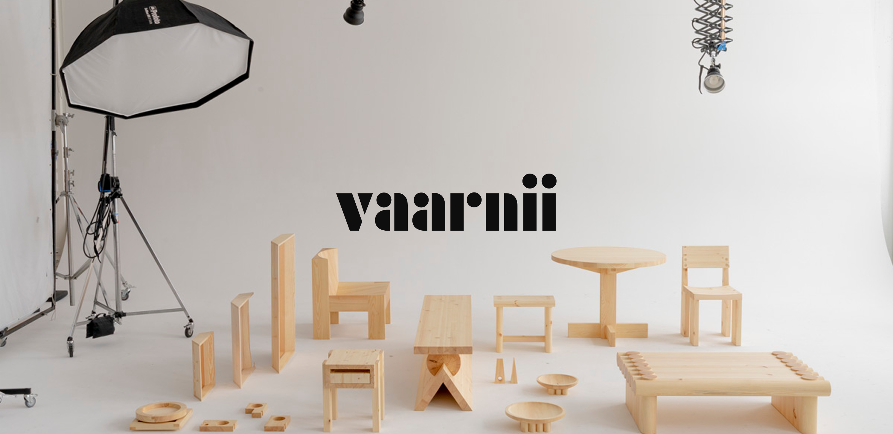
Vaarnii is a furniture company that makes brutal and sophisticated objects from a single natural raw material - Finnish pine, by local craftspeople and factories in Finland.
I came to this project through an agency, working as a team of two. Vaarnii was just starting out, a small team with a strong vision.
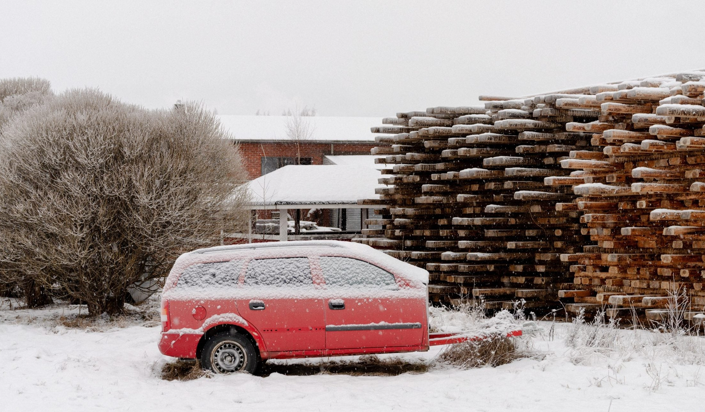
What already existed was a logo, typeface, a written philosophy, a mission - and a striking body of editorial photography that captured the brand feeling without showing a single product. The images had a particular moody Finnish quality: sparse, atmospheric. What wasn't yet defined was how the brand would live on screen.
My mandate was clear: build an e-commerce website, fast. Make it represent the brand and sell the products.
Two directions, one choice
Before touching a layout, I explored two distinct visual directions - not as design specs, but as bets about what the brand could become on screen.
Direction A
Dynamic composition, contrasting colours, floating images, geometric shapes in the background - echoes of sketching and structural thinking, the logic behind building an object.
Direction A.
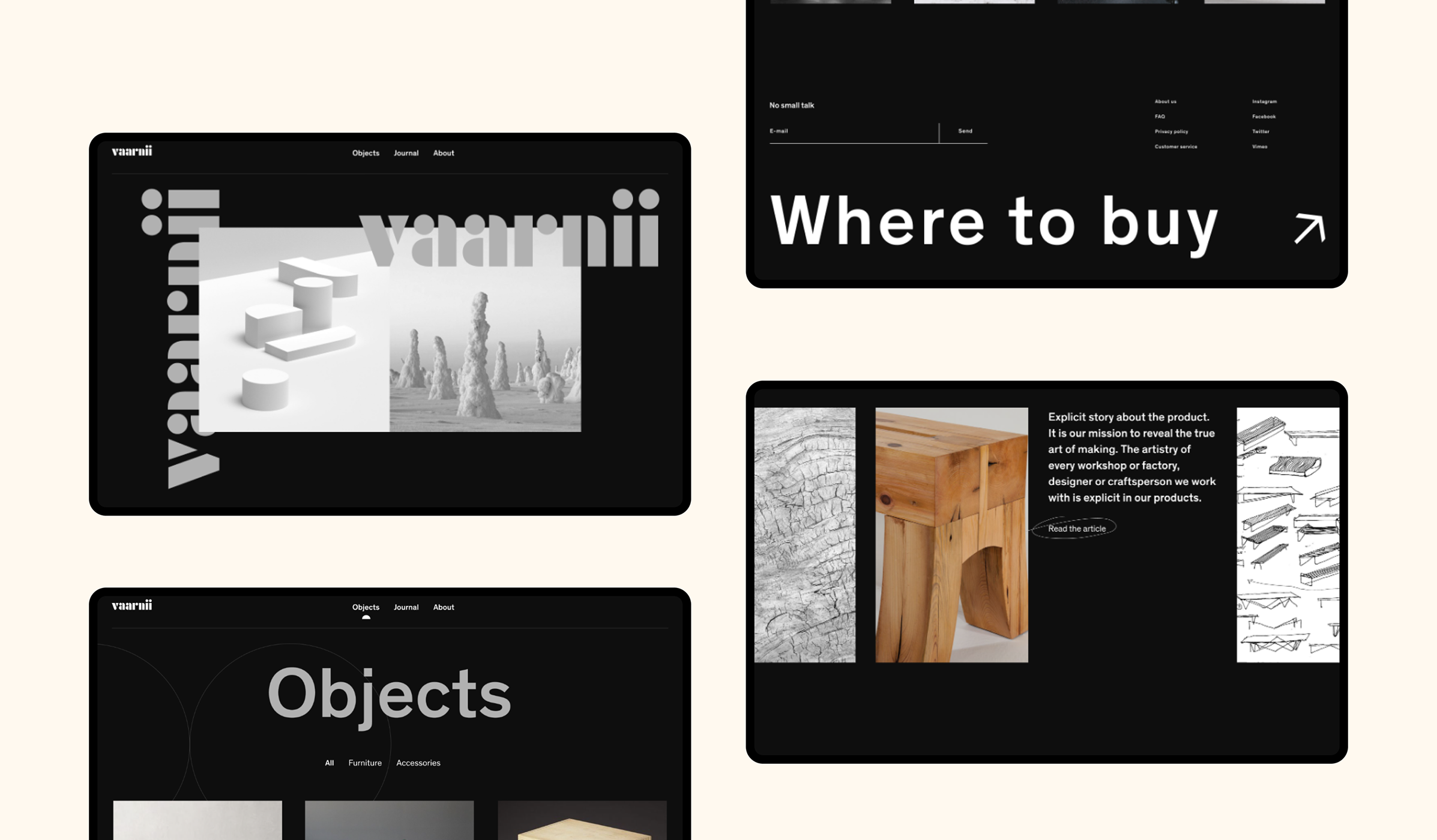
Direction B — chosen
Everything under grid and structure, generous white space, photography given room to breathe. The focus went entirely to the product, no decorations.
Direction B.
Architecture, expression, every element earning its place
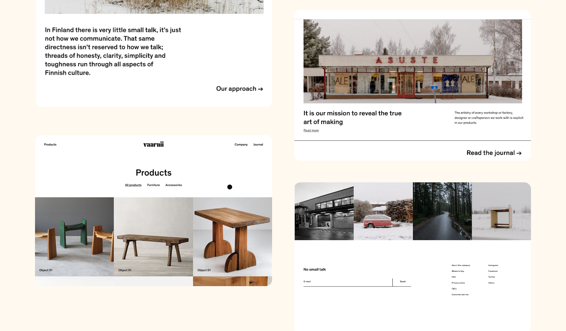
I structured the site with one primary user in mind: the buyer. Products come first. The story complements them, not the other way around. I aimed for as flat an architecture as possible, simple enough to navigate without thinking, rich enough to reward time spent.
The visual language carried the same logic as the brand itself. Layouts felt monumental - achieved through proportion and balanced composition. Imagery was given space to breathe and dominate.
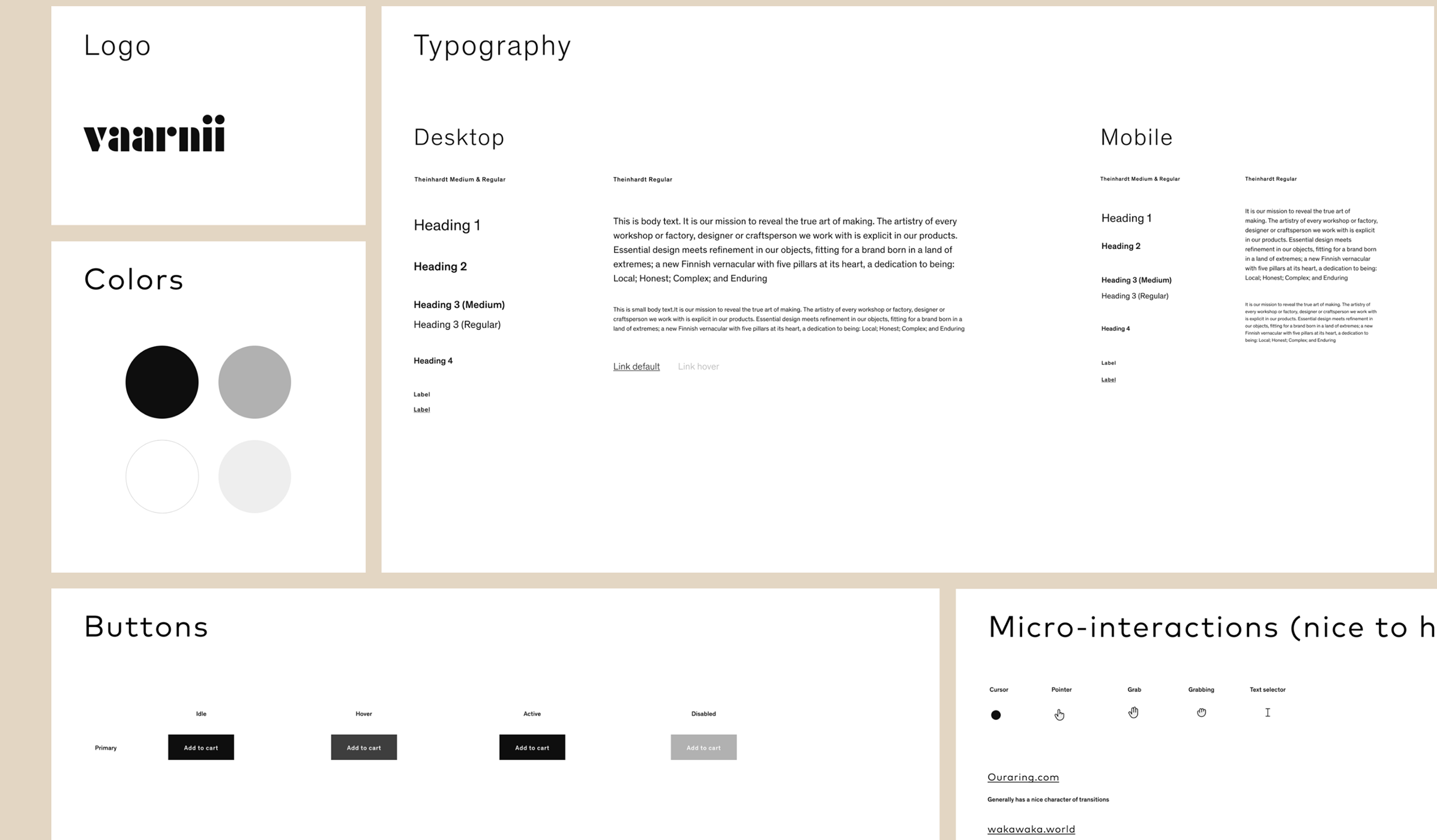
The visual system behind the site.
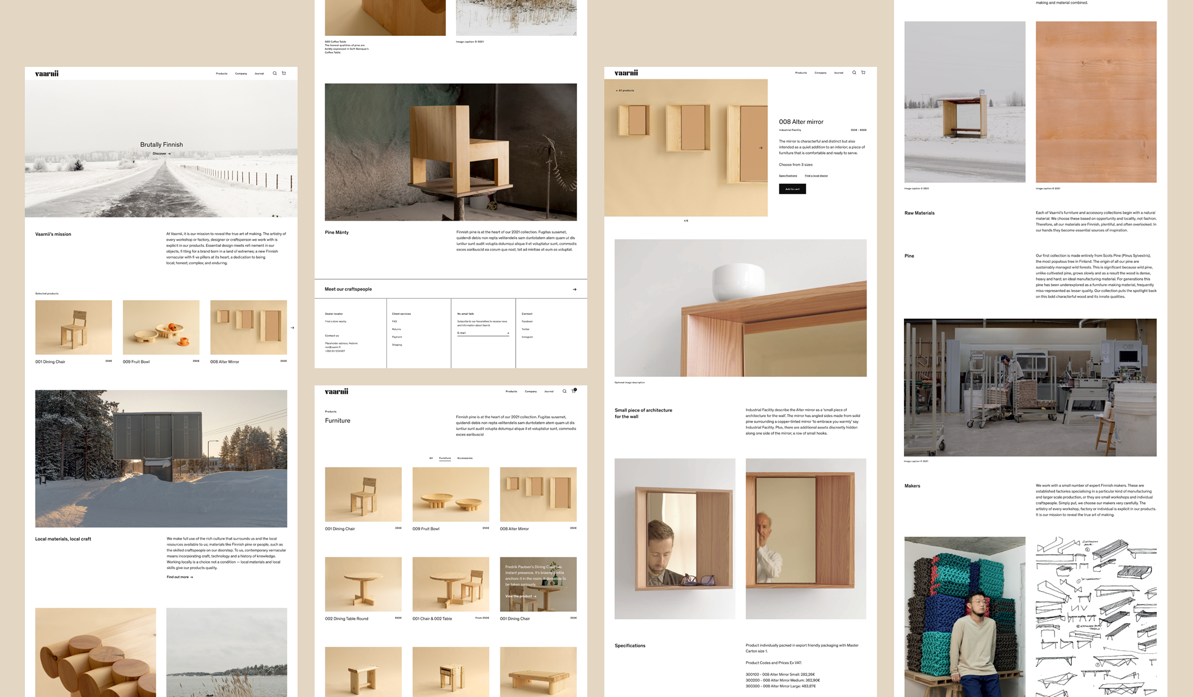
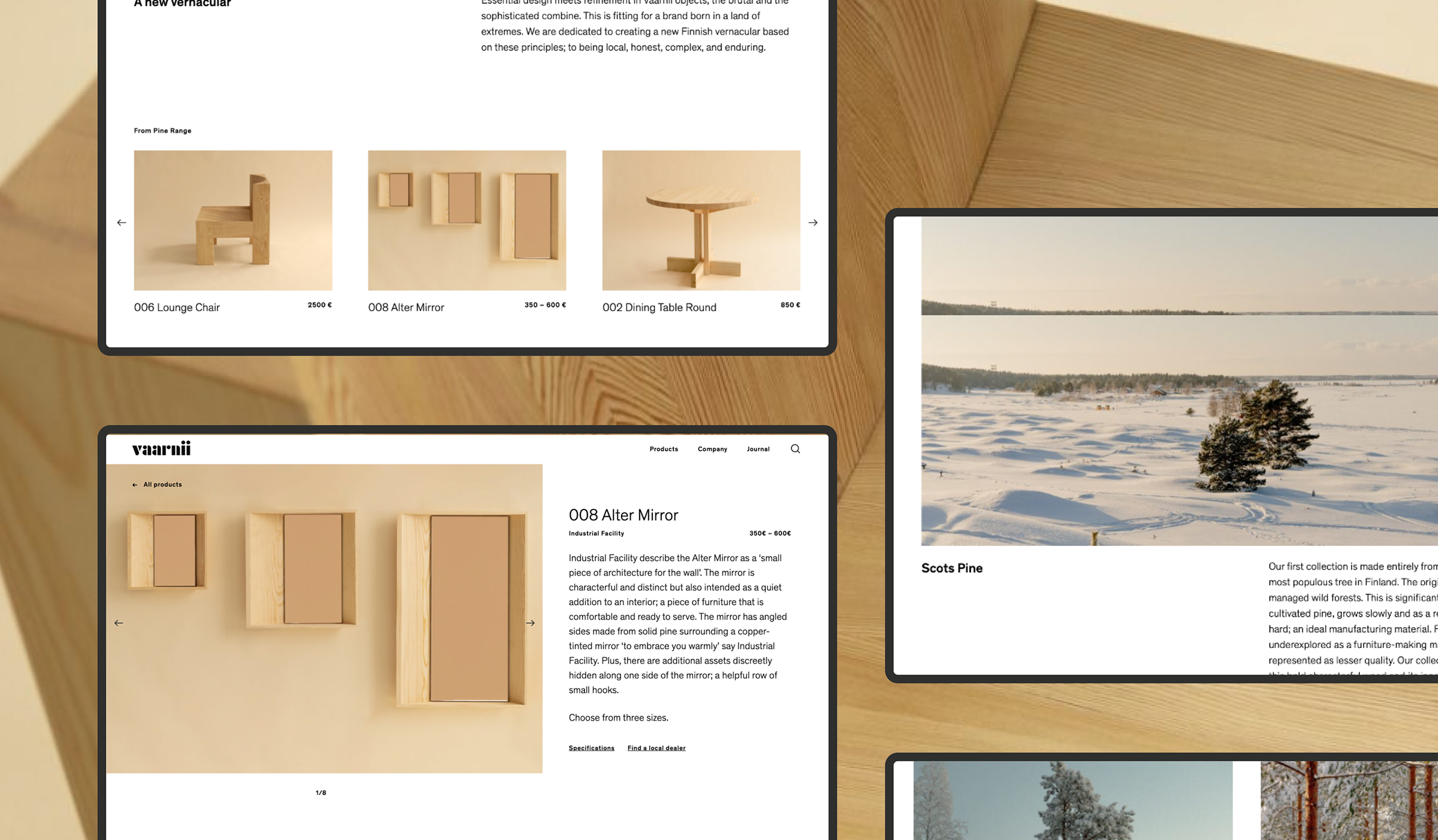
Desktop - product listing, page detail, about. Every section in its place.
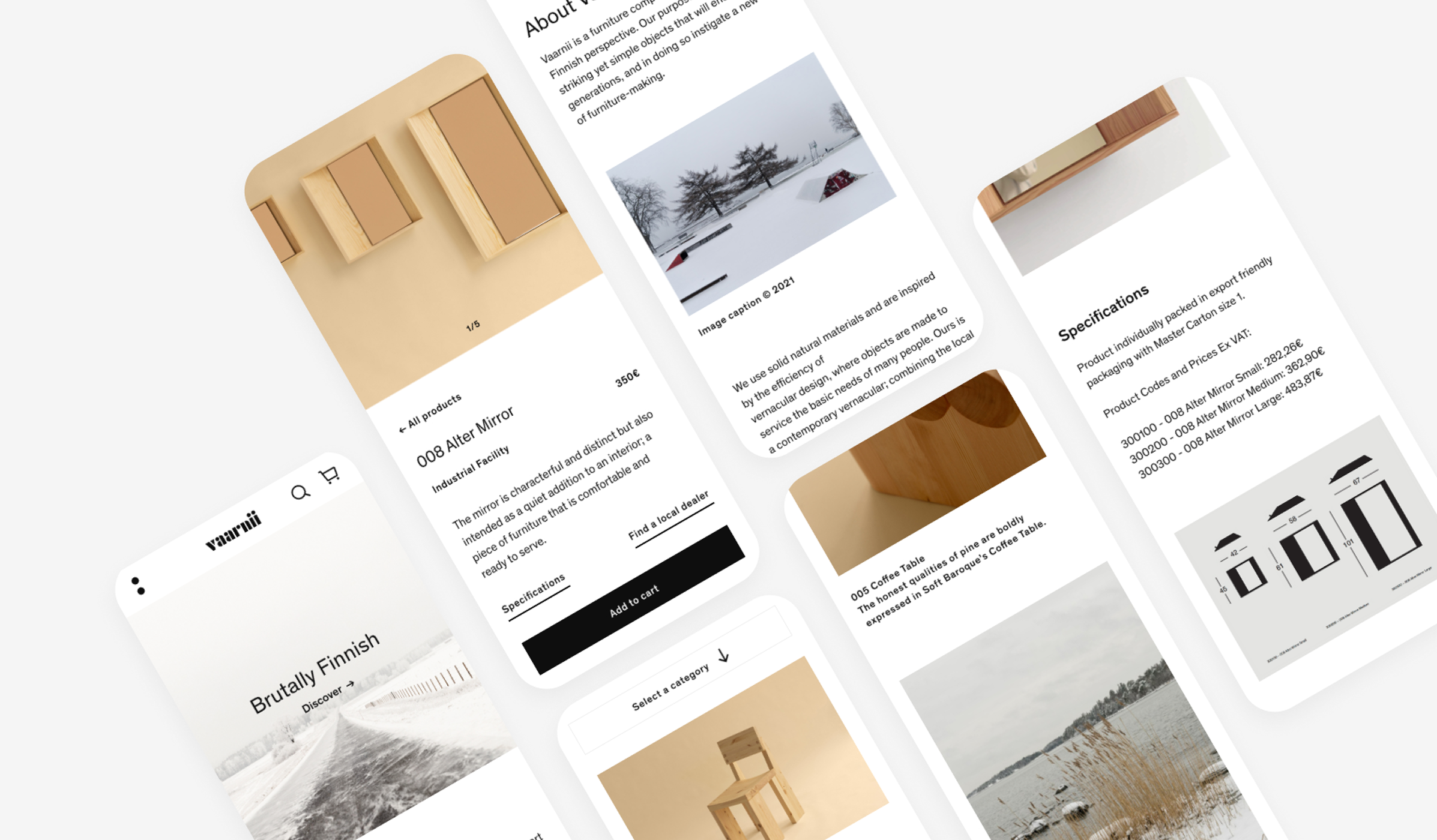
The same language, smaller screen.
Five years later, the direction holds
The site launched around five years ago. Ownership has changed, more sections have been added, more product categories have grown in - but the visual language, the composition, the tone remains the same. The direction defined at the beginning has absorbed five years of change without breaking.
That's what good foundations do. They don't resist growth - they give something to grow from. For me, it confirmed what I already suspected about how I work best: full ownership, genuine belief in what I'm making, and a client relationship built on trust rather than approval cycles.