Product design across an entire customer journey.
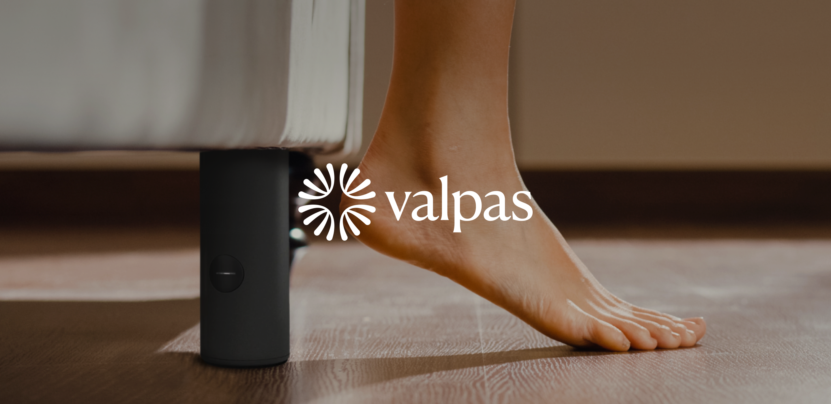
Smart bed leg
A physical device installed under hotel beds. Captures bed bugs and has sensors which allows to send real time notifications to staff through the mobile app.
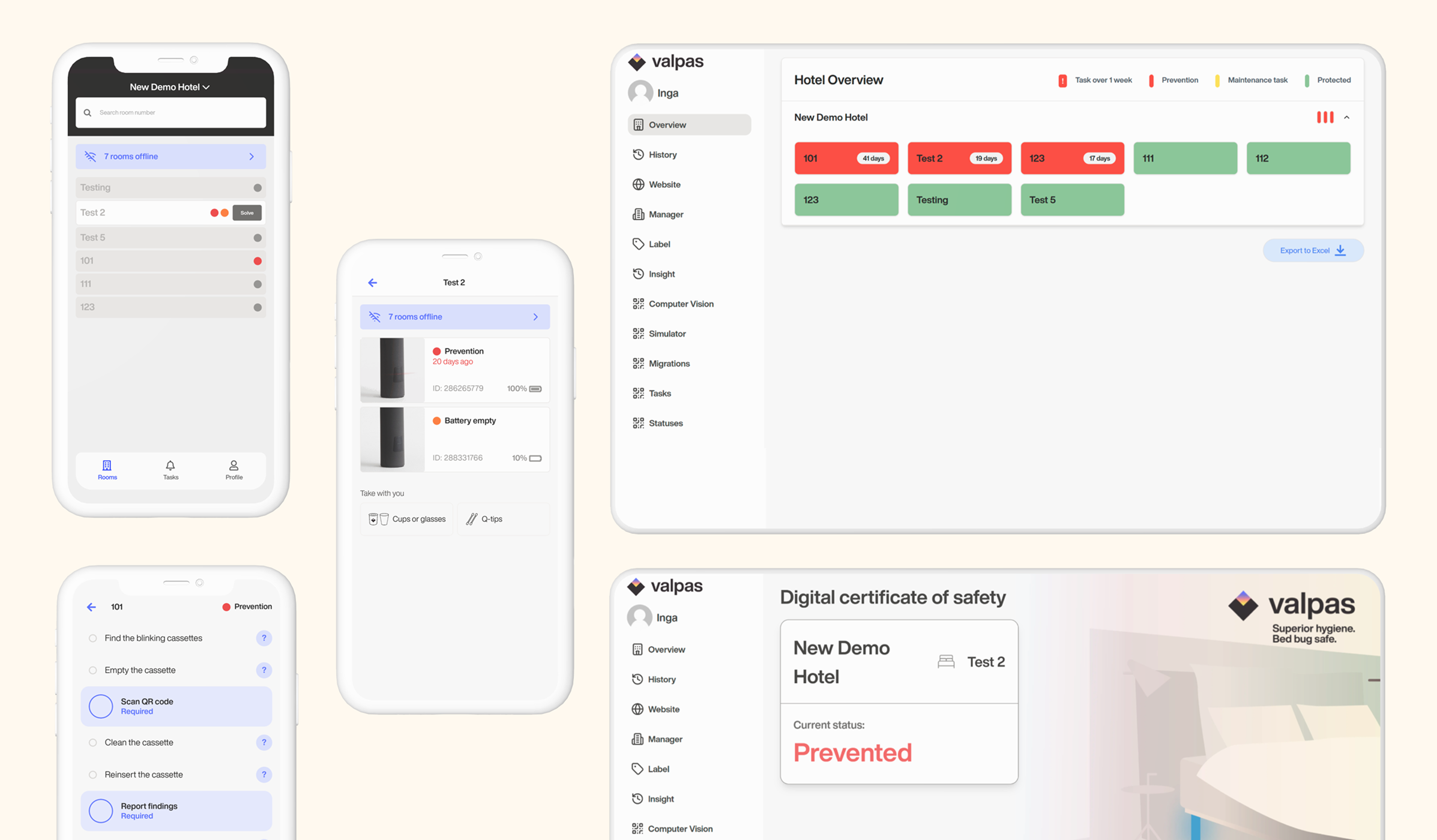
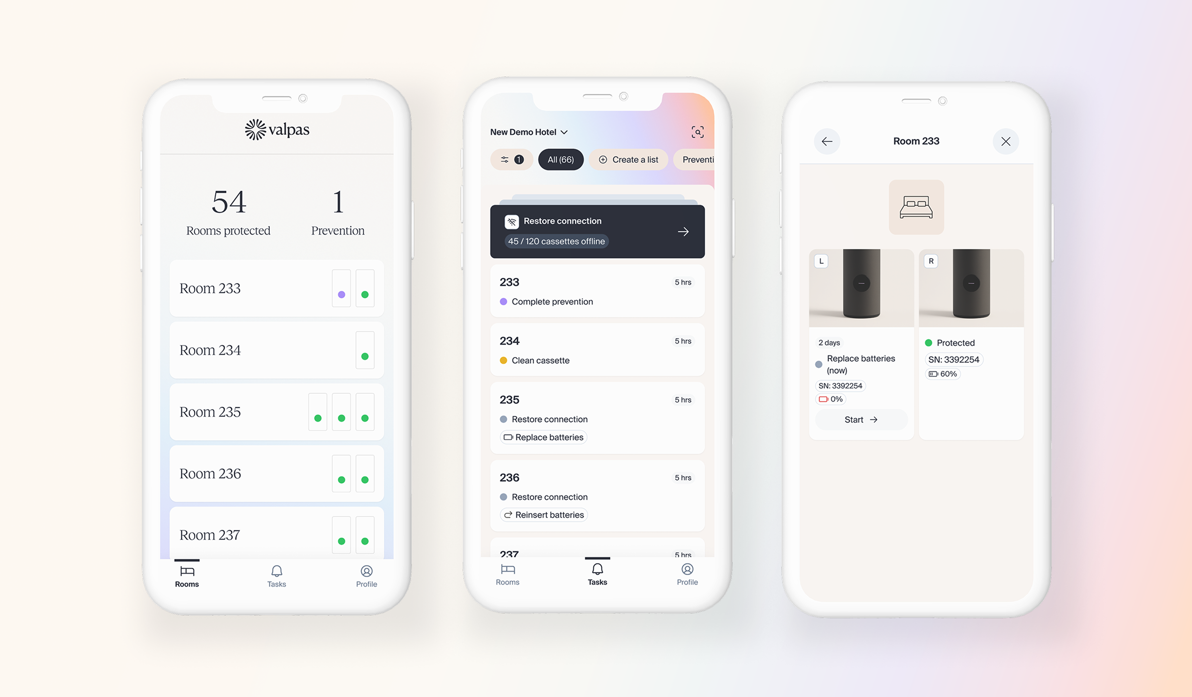
Mobile app
Used by trained staff, typically housekeepers. Manages day-to-day maintenance, prevention routines and bed bug inspection tasks.
Web app
Built for management and reception. Provides higher-level product metrics, performance data and operational oversight across the hotel.
A holistic mandate
When I joined, Valpas had come through a brand makeover with an external agency.
The new guidelines were striking - but they mostly lived in the website. The two core applications used by hotel staff, were visually outdated and functionally rough.
My mandate was holistic: understand and improve product touchpoints across the entire customer journey.
Research synthesis
Stakeholder alignment
Customer journeys
User interviews
Design audit
Competitive analysis
Tokens
Components
Design patterns
UX flows
Feature design
Interaction patterns
Physical touchpoints
Landing pages
Applications
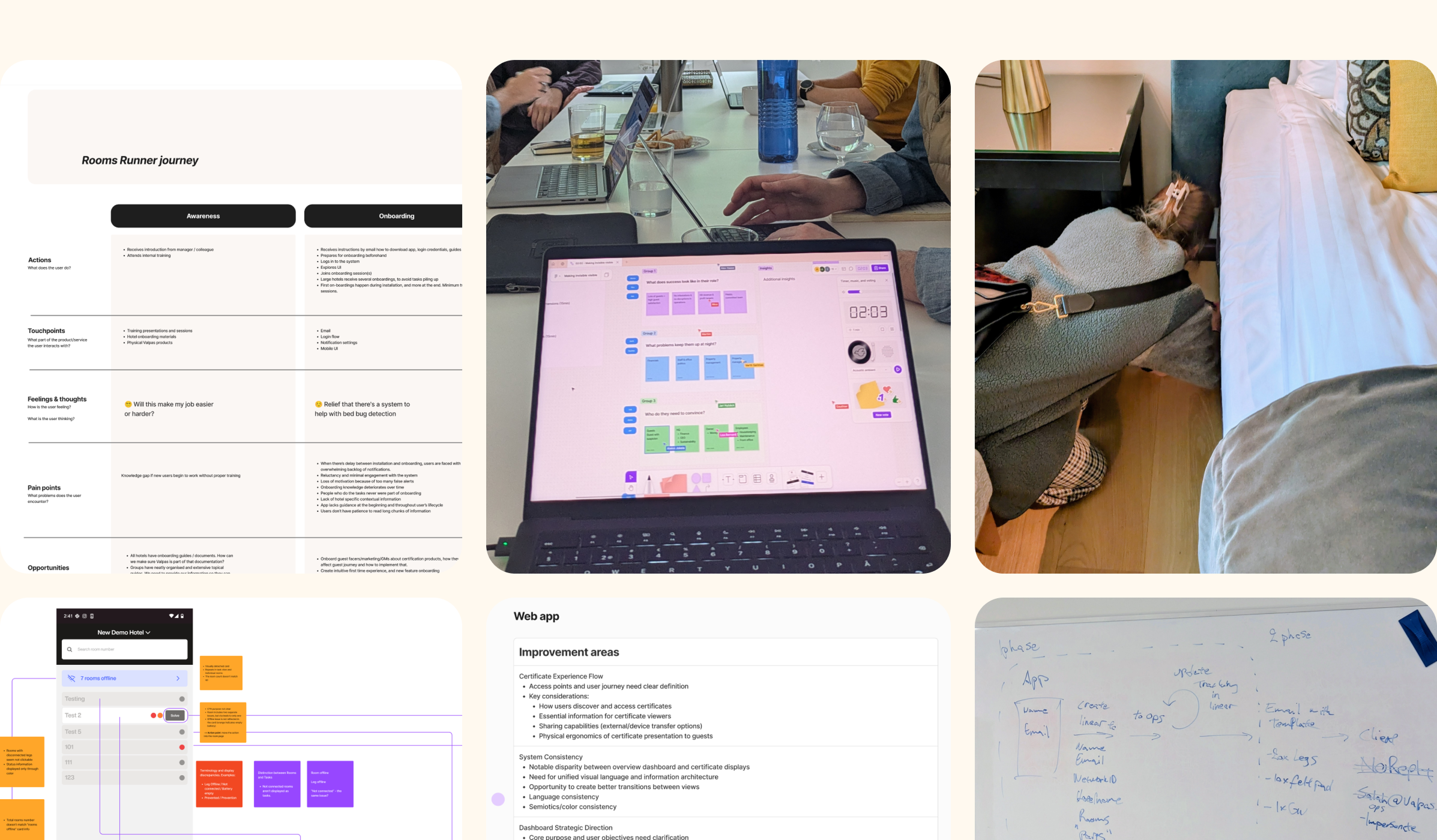
Audit, research, workshops, customer journeys. Getting close to the problem — sometimes literally.
Building the ground to stand on
I ran a full design audit across both applications - evaluating visual elements, patterns, accessibility, usability. During audit I had conversations with engineering, business and customer support.
For the system itself, I used shadcn as a base - a pragmatic choice given time constraints - and built the Valpas visual language on top of it: tokens, components, patterns. The challenge was making it feel genuinely on brand.
The web app was the right place to start: simpler functionality, faster to ship, and a clean proof of concept for the new visual language. Mobile was technically more complex — I worked feature by feature, addressing UX problems and renewing visual treatment within that scope.
Eventually the line between developer and designer began to blur. Frontend engineers started building tools themselves using existing patterns.
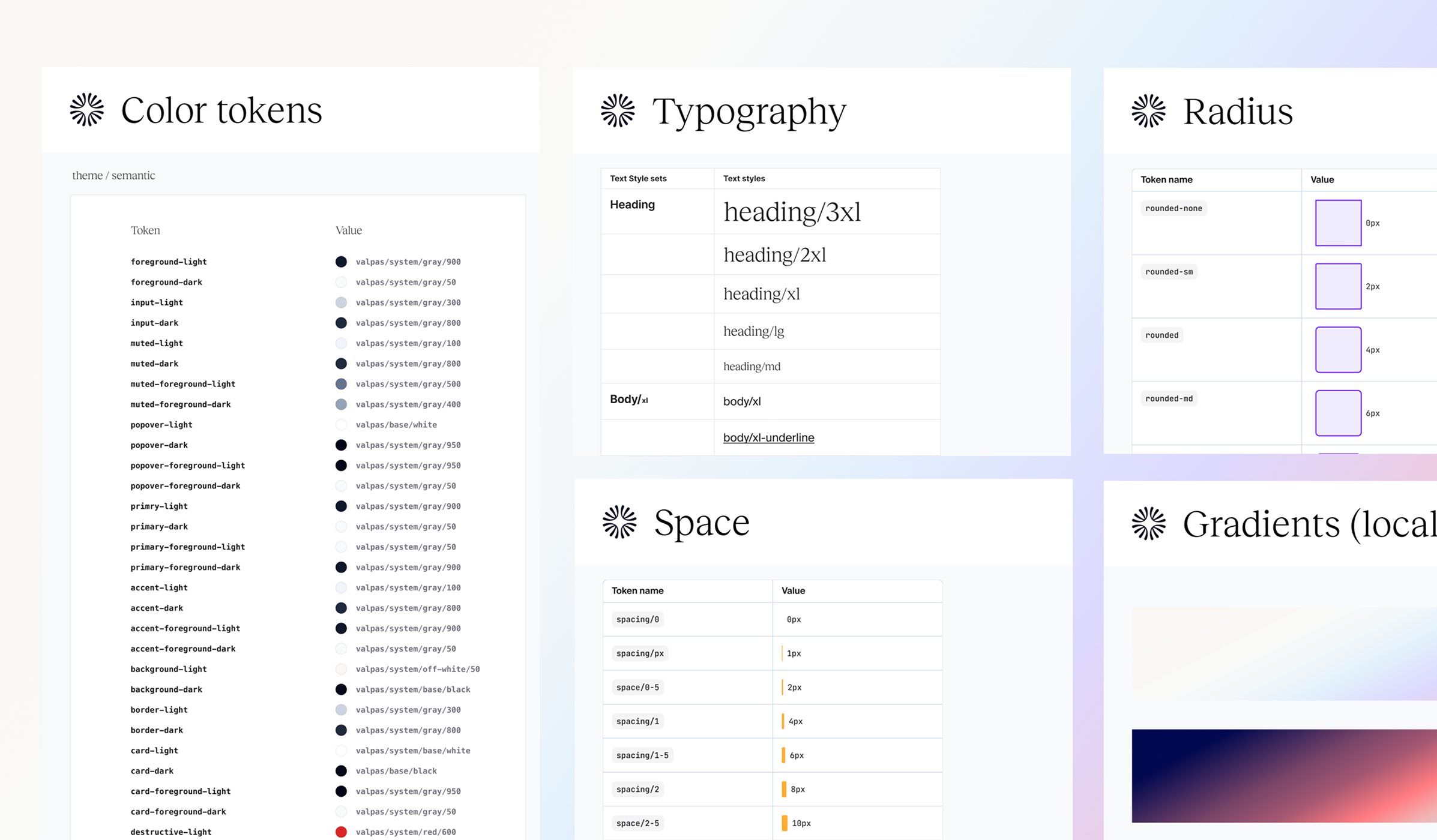
The visual foundation - colour, typography, spacing and shape tokens that every component is built from.
Before. A product with a lot of room to improve.
After. The information finally lands.
The same language, smaller screen.
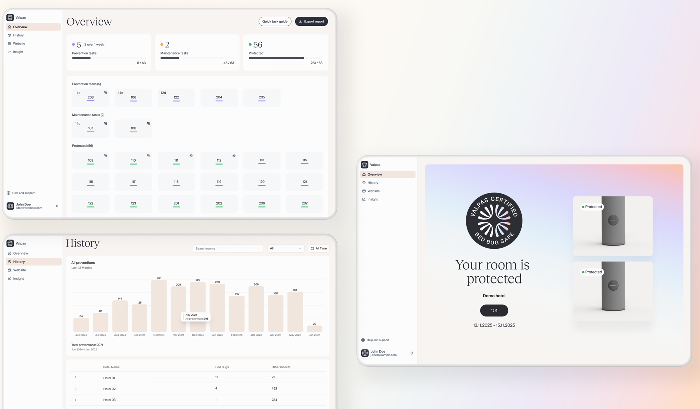
Making value visible to the people who decide
The challenge
Valpas has a particular problem: the product works by preventing something. When it's doing its job, often nothing visible happens. Over time, that silence becomes doubt. Decision makers at hotel groups start to perceive the service as a nice to have, or worse, assume they simply don't have a problem.
The solution
I designed a decision maker dashboard that surfaced key performance metrics in a single view: cost savings, environmental impact, prevented infestations, guest engagement through the certification touchpoints, and an operational score showing how effectively each hotel was running the platform.
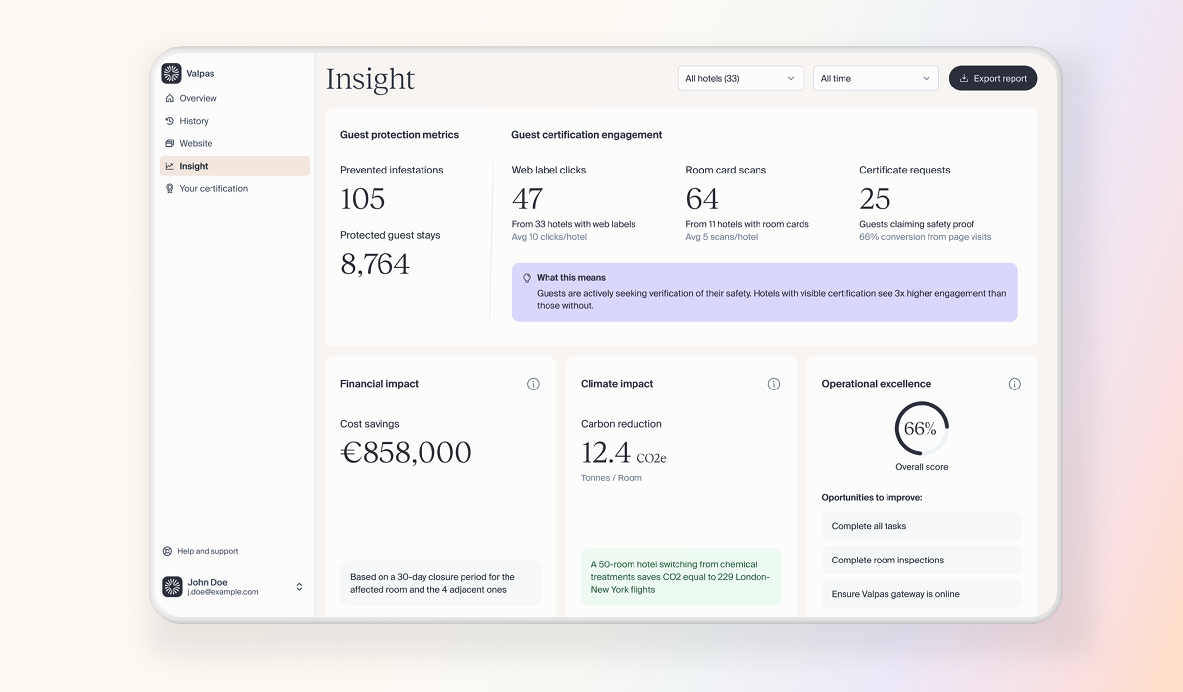
The value, made visible.
The outcome
Decision makers were genuinely surprised by what they saw. CO2 impact figures were particularly valuable for hotels working toward sustainability certifications. Operational scores surfaced bottlenecks that GMs were motivated to to fix. The data also revealed a new need: rather than something to check occasionally, decision makers wanted these metrics delivered monthly.
Value, delivered.
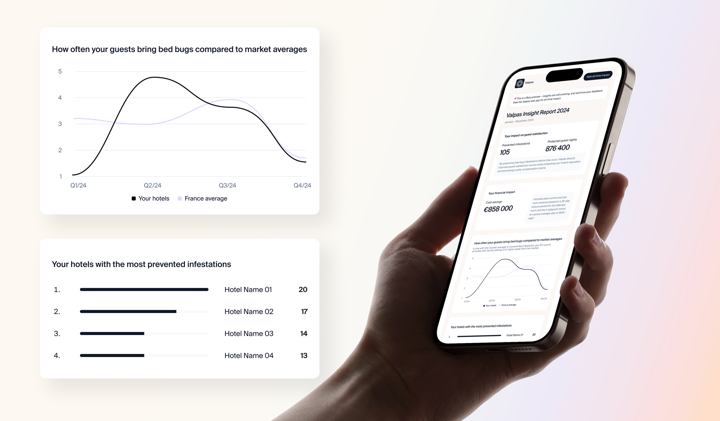
From room card to dashboard - end to end
The challenge
As Valpas began positioning around guest certification, a chicken and egg problem emerged. If hotels didn't display the certification touchpoints, there was no way to prove that guests cared. The only way out was to design a system that could start capturing sentiment even before the proof existed.
The solution
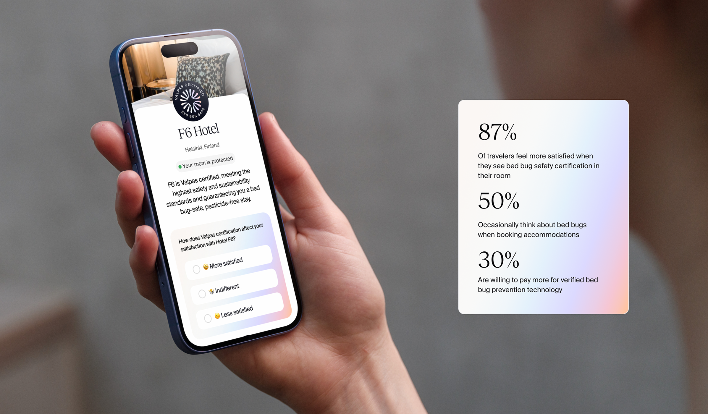
I designed a chain of certification touchpoints - some physical, some digital - working together as a single connected system. Each hotel received room cards with a unique QR code, directing guests to a hotel specific landing page with a short questionnaire capturing satisfaction, perception of room price, and an open field for reviews.
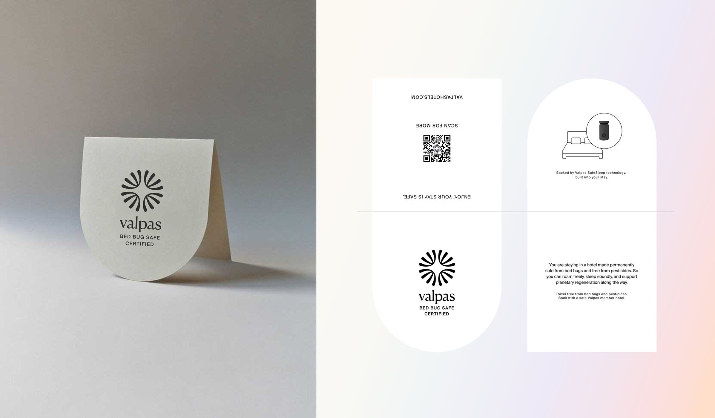
Each card carrying a unique QR code, one per hotel.
A hotel specific landing page capturing guest sentiment.
The outcome
87%
of travellers feel more satisfied when they see a hotel is certified
50%
occasionally think about bed bugs when booking accommodation
30%
would pay more for a bed bug-safe room
Numbers like these changed the nature of the sales and retention conversation. The product was no longer asking clients to trust a prevention claim - it could show guest sentiment, in their own words, from their own guests.
Removing the blinking red light
The challenge
The physical Valpas bed legs blink red when they capture something. Staff had to get on their knees and look under the bed to find which leg was blinking. Guests were frequently disturbed by a mysterious red light - some assumed it was a camera. And the blinking consumed battery, accelerating maintenance cycles.
The solution
Based on usage data, 90% of hotel rooms have exactly two bed legs. A simple positional confirmation - which side of the bed are you on? - was enough to map the room automatically. The logic underneath was pretty complex, but for the user it was almost invisible. Low effort, no extra steps, no guessing.
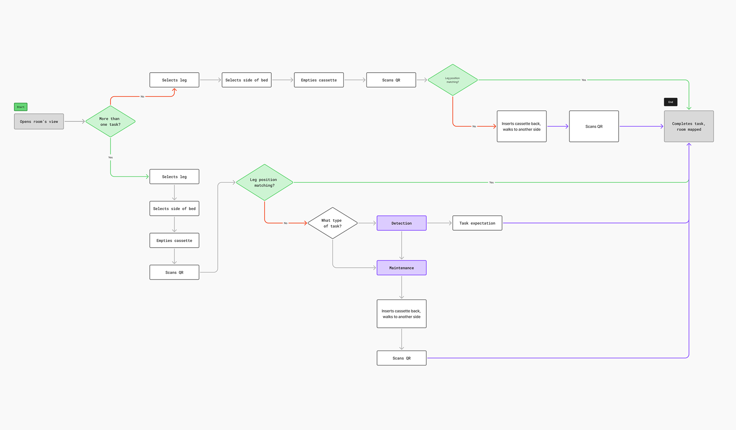
Complex logic, invisible experience.
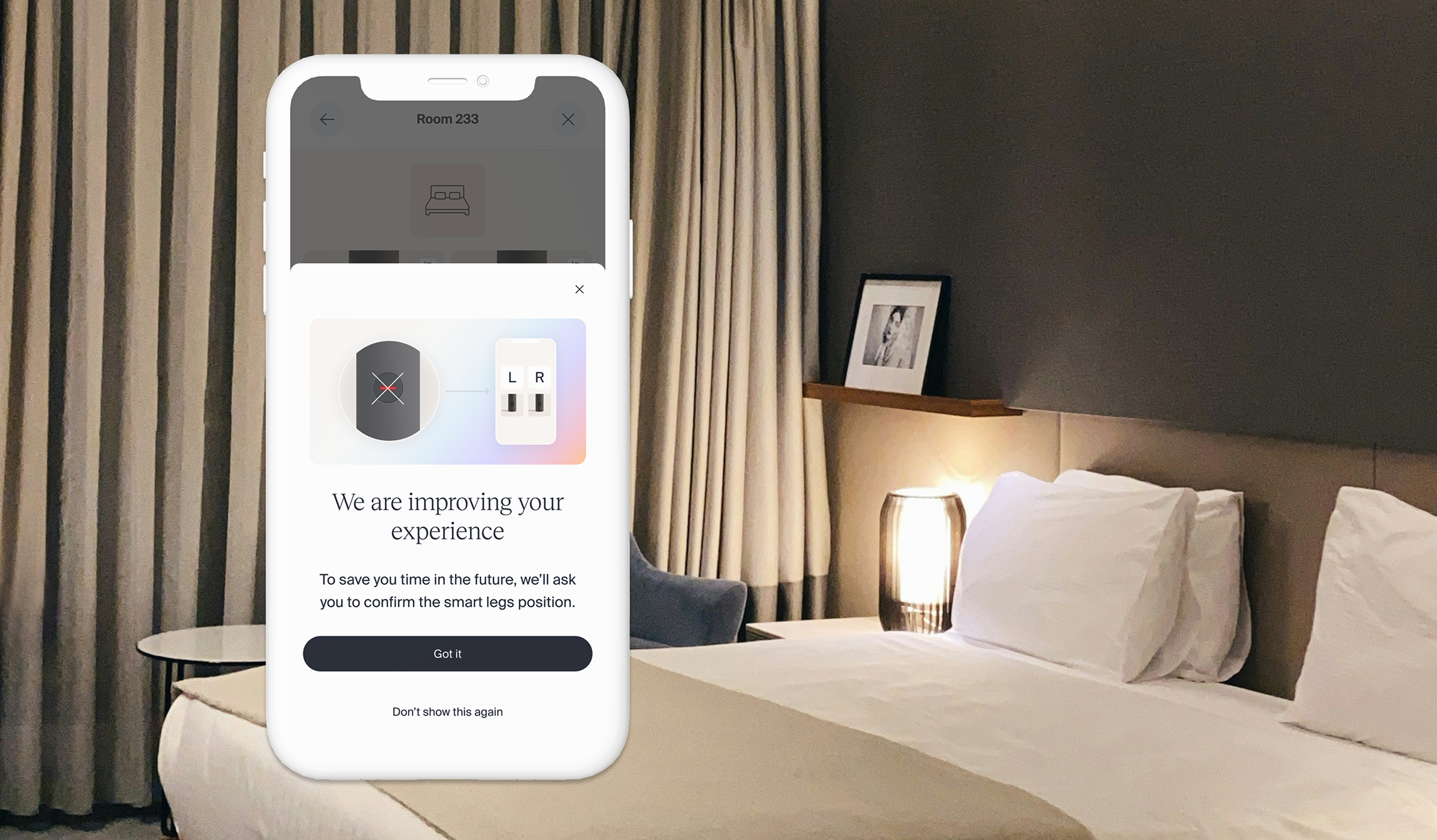
Correct place, correct leg, no guessing.
The outcome
- No more crawling under beds looking for a light
- Guests no longer disturbed by a mysterious blinking red light in their room.
- Battery life extended, reducing maintenance load and connectivity risk across the mesh network.
Users adopted it quickly with minimal friction. Not a visually striking feature, but that's exactly what good product design often is.
From a tool people had to use, to one they actually trusted
With everything I worked on at Valpas, I wanted to add quality and care - to make the experience as frictionless as possible for every person who touched the product. There was rarely an obvious solution. But I kept going - talking to users, bringing their reality back into the product, tackling bottlenecks one by one.
What that sustained effort produced was a product that felt coherent, considered and trustworthy across every touchpoint.